


Pregnancy + | Tracker App
Philips Electronics UK Limited
Pregnancy apps can easily become noisy: too many reminders, too much medical language, and a constant stream of information that is hard to sort when you are tired or worried. I found Pregnancy+ more approachable than many typical trackers because it puts the pregnancy journey into a clear, visual format and gives me a place to return when I want an explanation, a weekly overview, or simple preparation ideas. It is a free parenting app from Philips Electronics UK Limited, and its large user base is reflected in an average rating of 4.8 from around 3.5 million ratings.
What makes it useful is not just the amount of material. The better experience comes from having pregnancy information arranged around the stage I am in, rather than forcing me to search through a general health library. I can use it for quick check-ins during an ordinary day, then spend longer with the educational sections when I have the energy. That flexibility matters, especially because pregnancy does not feel the same every day.
How Pregnancy+ handles readability and navigation
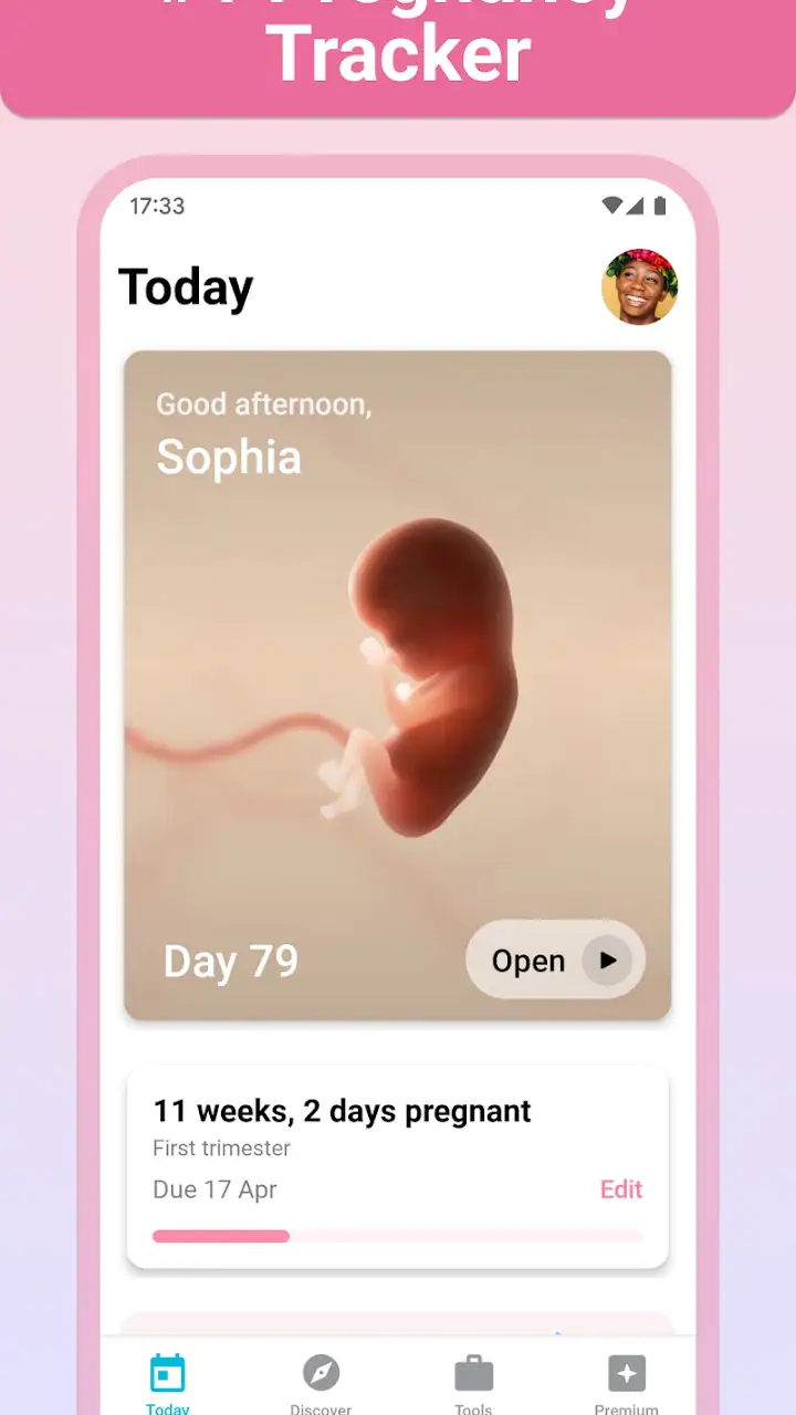
The app’s strongest quality is its visual organization. Pregnancy+ presents the journey as a sequence, so the current stage feels like the natural starting point. Instead of opening on a blank dashboard and asking me to build my own system, it gives me an immediate sense of where I am and what information is likely to be relevant now. That makes the first few minutes less intimidating for someone who has never used a pregnancy tracker.
I also like the difference between a quick glance and a deeper reading session. A person checking the app while waiting for an appointment can look for the main update and leave. Someone who wants more context can continue into the longer explanations and planning material. This layered approach is important for readability: not every user has the same concentration, eyesight, language confidence, or tolerance for dense content.
The illustrations and week-by-week presentation make abstract changes easier to understand. A pregnancy calendar alone can feel like a countdown, while visual explanations help connect the date with what may be happening. I would still treat the images as educational aids rather than exact representations of an individual baby. Bodies and pregnancies vary, and a polished visual cannot replace advice from a midwife or doctor.
Latest News

Uber Eats Under Pressure: What Happens When Delivery Goes Wrong

How QR & Barcode Scanner Adapts to Android and iOS Innovations

Why Waze Navigation & Live Traffic Is Your Essential Travel Companion

CapCut Mastery: Unleash Hidden Features for Pro-Level Editing

How OS Updates Enhance Roblox Adventures

Teacher Simulator: Exam Time Turns Quick Classroom Judgments into a Repetitive Loop
For a first-time parent, the navigation is particularly reassuring because the app gives a sense of progression. It can also help a partner or family member understand what the pregnant person may be experiencing without requiring them to read a complete pregnancy book. I found that useful when sharing a particular topic in conversation: the app can act as a prompt for a question rather than pretending to settle every question itself.
There is a practical advantage to this structure when attention is limited. If nausea, fatigue, anxiety, or a busy routine makes long reading difficult, I can use the app in short visits. I recommend choosing one small purpose before opening it, such as checking the current weekly guidance or reviewing a preparation topic. That prevents the large amount of content from turning into another task to manage.
The interface is not automatically perfect for everyone. Visual organization helps many people, but a user who prefers plain text, a compact list, or a personal notebook may find the presentation more elaborate than necessary. The app is designed to make pregnancy feel engaging and understandable; that is different from being the fastest possible reference tool.
Gallery
Readable content without replacing clinical guidance
Pregnancy+ works best as a translation layer between formal health information and everyday questions. It can make topics less intimidating, but I would not use it to interpret a worrying symptom, decide whether something is urgent, or change treatment. If something feels unusual, the correct next step is professional medical advice, not scrolling through similar-looking entries.
That boundary is especially important for users with anxiety. A tracker can be comforting because it offers structure, yet it can also encourage repeated checking. I found it healthier to use the educational content at a planned time and avoid treating every update as a test that I must pass. The app supports preparation; it does not provide personal diagnosis.
Its age rating is Everyone, which fits its role as a family-oriented information app. That does not mean every topic will feel equally suitable for every reader. Pregnancy can involve sensitive subjects, and a partner or younger family member may need context when looking through the material. I appreciate the generally explanatory tone, but personal comfort still matters.
Motor, sensory, and situational considerations
Pregnancy+ is also worth judging by how it feels to use when the user is uncomfortable, distracted, or physically limited. A person may be using it one-handed on a bus, lying down with low energy, or trying to read while managing other children. In those situations, the app’s visual progression and short entry points are more useful than a design that expects a long, uninterrupted session.
For motor access, I found the best approach was to avoid trying to complete everything in one visit. Browsing the main pregnancy information is less demanding than treating the app as a detailed administrative system. If a user has reduced dexterity or difficulty with precise taps, the practical question is whether the core content remains worthwhile without optional tracking or extra personalization. In my experience, it does, because the educational journey is the main reason to open it.
That said, users who need very large controls, strong magnification support, or a highly simplified interface should test the app on their own phone before relying on it. Screen size, operating-system settings, and personal vision needs make a major difference. I would turn on the device’s standard text and display adjustments first, then check whether the layout remains comfortable. I would not assume that an app’s attractive design automatically meets every accessibility need.
For sensory considerations, the visual content can be a strength and a weakness. Visual explanations may help someone who finds long medical paragraphs difficult, while they may be tiring for a user who is sensitive to busy screens or prefers minimal stimulation. A calmer routine helps: read one topic, pause, and close the app rather than moving through every available section.
The app can be useful for people with different levels of health literacy because it gives everyday context to pregnancy milestones. A partner who does not know the terminology can use it as a shared reference, and someone who is more comfortable learning visually may find the illustrations easier than a traditional book. Still, users who need screen-reader-first navigation or a specific communication format should verify the experience directly on their device rather than assuming all content will work equally well.
Language and cultural context can also affect how comfortable an app feels. Pregnancy+ is most helpful when its explanations match the user’s healthcare environment and personal expectations. I would use it alongside local prenatal guidance, especially for appointment schedules, warning signs, nutrition questions, or care decisions. The app can organize learning, but local professionals remain the better source for advice that depends on medical history or regional practice.
A realistic everyday routine
Imagine opening Pregnancy+ after breakfast while waiting for a child to get ready for school. I would check the current weekly section, read one short topic, and make a note of a question to raise at the next appointment. Later, during a quieter moment, I might return to the preparation material with a partner. This two-step routine is more realistic than expecting the app to replace a pregnancy book or become a daily journal.
Another useful workflow is to use it before a healthcare visit, not during a moment of panic. I can browse the relevant stage, separate general information from personal symptoms, and write down clear questions. That makes the appointment more productive without turning the app into a substitute for the clinician. The important trade-off is that the app helps me prepare, but it cannot personalize the answer to the same degree as a professional who knows my history.
For someone with limited energy, I would avoid trying to complete every optional activity. The most valuable use may be the weekly overview and a small selection of educational topics. For a partner, the app can provide a shared vocabulary. For a user who prefers strict control over reminders and data entry, a simple calendar and a notebook may feel less demanding.
What remains difficult and who may prefer another option
The biggest barrier is content volume. A pregnancy app can make a person feel informed, but it can also create the impression that there is always another article, checklist, or update to read. Users who are prone to worry may need firm limits around checking. I would not recommend opening it repeatedly to compare every sensation with an app entry.
There is also a difference between a guided pregnancy companion and a clinical record. Pregnancy+ is suitable for learning and preparation, but it should not be the only place for appointment details, test results, medication instructions, or urgent contacts. If someone wants a tool centered on communicating with a care team, recording medical information, or following a provider’s exact plan, a healthcare service or dedicated record system may be a better fit.
The free download makes it easy to try, but some optional items are offered as in-app purchases ranging from $0.99 to $39.99 per item. I would explore the free experience first and decide whether any extra material genuinely solves a problem. A user who dislikes sales prompts or wants every feature included without additional decisions may prefer a simpler resource.
The current version is 7.4 and it runs on Android from version 8.0 onward. That makes it accessible to many existing devices, although anyone using an older phone should check compatibility before planning around it. Device performance, display settings, and operating-system accessibility tools can change how comfortable the app feels, so the same interface may be easier for one person than another.
Privacy and personal comfort are also part of the decision whenever an app relates to pregnancy. I would read the app’s current permissions and privacy choices on the device before entering sensitive information, then share only what feels necessary. This is not a criticism unique to Pregnancy+; it is a sensible habit for any health-related app. People who want to keep pregnancy information entirely offline may be happier with a printed guide and a paper calendar.
Some users may also prefer a less emotionally polished experience. Pregnancy+ presents the journey in a friendly, approachable way, which can make the process feel less clinical. But a person who wants a neutral reference with no illustrations, milestones, or lifestyle framing might find a medical website or book more direct. In that case, the app’s warmth becomes unnecessary decoration rather than a benefit.
How it compares with ordinary alternatives
Compared with a paper pregnancy book, Pregnancy+ is easier to carry and more naturally organized around the current stage. A book can be calmer, easier to annotate, and more comfortable for people who want to avoid screens. Compared with a basic calendar, the app offers much more explanation and context, but a calendar is better for users who only need appointment reminders and dates.
Compared with general web searches, the app gives me a more focused starting point and reduces the temptation to jump between unrelated pages. Search engines remain better when I need a very specific local service, a professional organization, or an answer tied to an unusual medical situation. The app’s advantage is continuity, not universal authority.
Compared with a provider’s patient portal, Pregnancy+ is more approachable for everyday learning, while the portal is the proper place for clinical communication and personal records. I would use both if needed rather than asking one to perform the other’s job. That combination is especially helpful for users who need accessible explanations before discussing a topic with a clinician.
My inclusive verdict
After spending time with Pregnancy+, I see it as a friendly, flexible companion for people who want pregnancy information presented in manageable stages. Its visual structure supports quick visits, its educational material can help partners participate, and its free entry point makes it easy to judge personally. The app has reached over 50 million installs, which also explains why it feels like a mainstream option rather than a niche journal.
My main recommendation is to use it as a preparation and learning tool, not as a medical decision-maker. That distinction improves the experience. Read a small amount at a time, save questions for an appointment, and avoid letting the weekly structure become a source of pressure. If the visual approach helps you understand what is happening, it can be genuinely reassuring.
I would recommend it to first-time parents, partners who want a shared guide, and users who prefer visual explanations over a dense book. It is also a good choice for someone who wants to dip in and out rather than maintain a detailed daily log. The app’s parenting focus and Everyone content rating make it approachable for family use, although sensitive subjects still deserve personal judgment.
I would suggest looking elsewhere if you need a strictly clinical record, a provider-connected care tool, a completely offline experience, or a very minimal interface. Users with specific screen-reader, vision, motor, or sensory requirements should test the actual layout with their own device settings before committing. The app can support different abilities and situations, but no attractive interface can guarantee a comfortable experience for every person.
Overall, Pregnancy+ earns its place by making a complicated period easier to explore without demanding that I become an expert. It is free to start, developed by Philips Electronics UK Limited, and has been available since Jan 28, 2013. With thoughtful limits around reading, careful handling of personal information, and professional guidance for health decisions, I think it is a worthwhile pregnancy tracker for many families.
FAQs for Pregnancy + | Tracker App
What features does the Pregnancy + Tracker App offer?
The Pregnancy + Tracker App provides a comprehensive range of features including weekly updates on fetal development, 3D fetal images, a contraction timer, kick counter, and a personal diary. Users can also access nutritional advice, maternity guides, and customizable birth plans. These features aim to support expectant parents throughout their pregnancy journey.
Is the Pregnancy + Tracker App free to use?
The Pregnancy + Tracker App offers a free version with basic features. However, to access premium content and advanced tools like the full range of educational articles and personal diary options, users may need to upgrade to a paid subscription. This ensures users can choose the level of detail they wish to engage with.
How reliable is the information provided by the Pregnancy + Tracker App?
The app is developed in collaboration with healthcare professionals to ensure that all information is accurate and up-to-date. It includes medically reviewed articles and guides, providing users with reliable insights into pregnancy health, development stages, and maternity care. Users can trust the app for credible advice.
Can I customize the Pregnancy + Tracker App to suit my personal needs?
Yes, the Pregnancy + Tracker App allows significant customization. Users can input personal data, track specific metrics, and set personal reminders. The app also offers personalized tips and content based on the user’s pregnancy stage, ensuring a tailored experience that meets individual preferences and needs.
Is the Pregnancy + Tracker App available in multiple languages?
The app supports multiple languages, catering to a diverse global user base. It is designed to be accessible to non-English speakers, offering translations for key features and content. Users can easily switch to their preferred language within the app settings, enhancing usability and user experience.
Pros
- Comprehensive daily updates.
- User-friendly interface.
- Includes contraction timer.
- Customizable settings.
- Supports multiple languages.
Cons
- Contains in-app purchases.
- Requires internet for full features.
- Ads can be intrusive.
- Limited free content.
- Some features need premium.


